
How do you communicate complex services for the scientific community in ways that are not only true to the science but also make sense to a general, non-scientific audience? These two films show the services provide by Copernicus, the EU satellite monitoring programme.
Read MoreCreating a digital campaign for UNEP
We created digital campaign resources for UNEP to celebrate 30 years of international effort to protect the ozone layer. A key film highlights the dangerous global warming potential of replacement gases, and the 135 billion tonnes of CO2e that the Montreal Protocol has kept out of the atmosphere.
Read MoreResource efficiency in Asia Pacific
A Carbon Visuals Project
CLIENT
United Nations Environment Programme, undertaken by Carbon Visuals
PURPOSE
To convey the scale and complexity of resource use in the Asia Pacific region at a conference of Environment Ministers and subsequently to other audiences.
DESCRIPTION
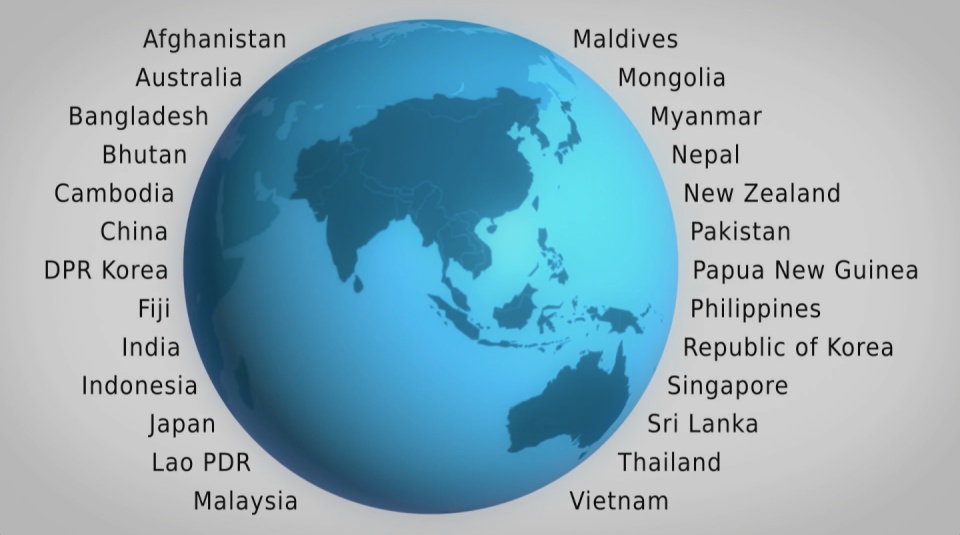
A high impact video and interactive web-tools to introduce and enable easy exploration of a database covering 26 Asia Pacific countries, 157 indicators and 40 years.
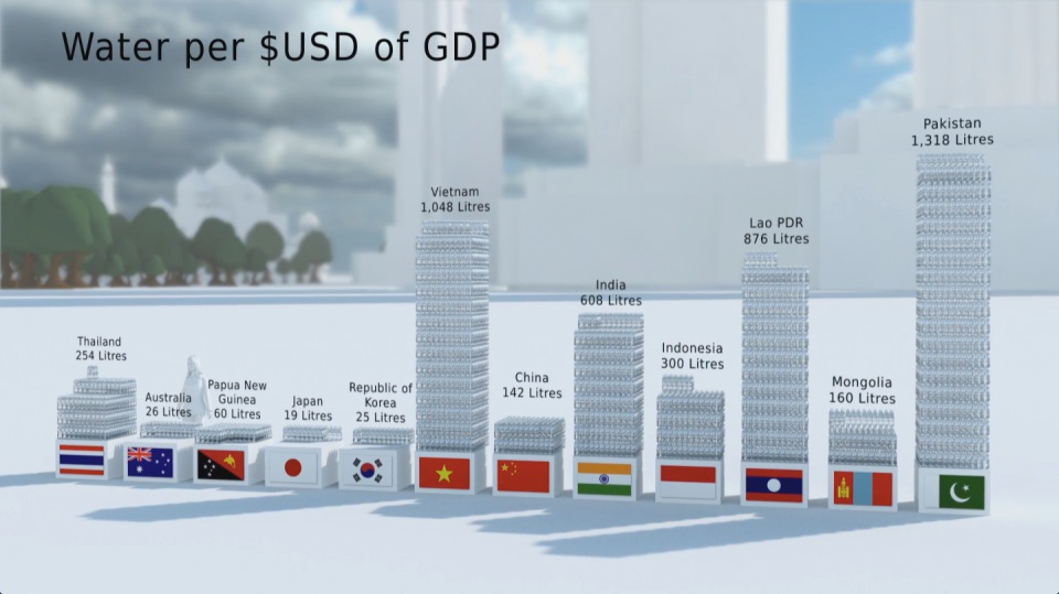
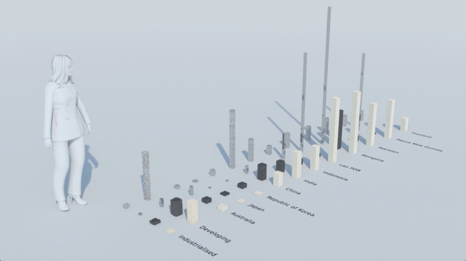
How much natural resources are used to earn one dollar in developing countries in the Asia Pacific region? How do you effectively show water, metal and biomass usage rates across 26 Asian countries - and make it personal and real? What is the best way to visualise a range of environmental resource indicators ‘per GDP’ across countries?
These were some of the challenges set for us by the United Nations Environment Programme (UNEP) in a project undertaken in conjunction with our not-for-profit partner CarbonSense Foundation.
This video has taken our communications to a higher level, and improved our ability to cut across a crowded policy landscape to really help decision makers reflect on resource efficiency.
Janet Salem, UNEP, Bangkok
The brief from the UNEP Bangkok office was to design and create a short, high impact video to convey the scale and complexity of resource use in the Asia Pacific region. In addition a set of interactive web-tools is being provided to complement the film and allow easy exploration of the data.
The film is supporting a database of resource efficiency data covering 26 Asia Pacific countries, 157 indicators and 40 years (1970-2010). The indicators are designed to inform policy development in the region based on the principles of circular economy, sustainable consumption and production principles.*
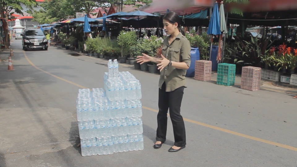
Resource efficiency is crucial for sustainability but how do you make it real and meaningful at a national and a personal level? To bring such a huge subject up front and personal, we combined live action film introducing very real piles of materials on a table-top with national and regional resource use and impacts made tangible with CGI graphics. And uniquely this project allowed us to explore ways that our creative techniques could be combined with economic data.
Because of the complexity of data and fast-track time schedule the project was carried out in a highly collaborative way, with UNEP staff in Bangkok supporting our creative team throughout the scoping, design and production phases.
The film was used to launch the UNEP Report at a conference on 19th May 2015 attended by Achim Steiner, Executive Director of UNEP, and Environment Ministers and policy makers from the Asia Pacific region.
See the UNEP webpage on project here
Finally - a very special thanks to Janet Salem of UNEP, Bangkok and our film presenter / narrator Patchari Raksawong.
*The database has been developed as a result of a three-year science-based consultative process mandated by countries in the region and coordinated by UNEP, the CSIRO and the Asia-Pacific Roundtable on Sustainable Consumption and Production (APRSCP), with support from the European Union's SWITCH-Asia Programme.
An important part of this project was the creation of an interactive web-tool (see above) allowing policymakers to explore the database in detail in an intuitive way. We created a 'heat map' that allows comparison between a wide range of economic indicators for different countries. Mousing over the countries reveals the actual data. See in new and larger window here.
Carbon Visuals has shown us different techniques to visualize data in a way that can resonate on a meaningful human level, while still giving us creative space for collaboration. We had a lot of fun with the team and it's been a really wonderful partnership.
Janet Salem, UNEP, Bangkok
Ireland's carbon footprint
Ireland's Environmental Protection Agency (EPA) wanted simple visuals to show the country’s carbon footprint. We created a short animation showing the daily emissions in Dublin bay to inform and engage a wide range of audiences, from policymakers to the general public.
Read MoreUK 80% reduction target – in Piccadilly Circus
This simple animation was created to highlight the UK Government’s 2050 carbon reduction target of 80%. By using Piccadilly Circus and shifting the scale to that of a single person we were able to create a stir on social media about a 70 page Report.
Read MoreThe world’s fossil fuel use and emissions
We made this high budget film to show actual quantities of the current global fossil fuel consumption and carbon emissions. It was shown to world leaders, industry experts, campaigners and scientists at the UN Climate Summit, New York, September 2014 to catalyse and inform conversations about reducing carbon emissions. Jump to the fossil fuel extract here.
Read MoreMaking sense of carbon, trees and timber
How much carbon is stored in a tree? How does that translate into cut timber and wood products? And how much carbon can be ‘banked’ by using timber for building houses? This communication project showed the carbon benefits of using wood and timber in the UK construction sector.
Read MoreIllustrating a 90% carbon reduction
A Carbon Visuals Project
CLIENT
Interface, undertaken by Carbon Visuals
PURPOSE
To show the 90% carbon reduction achieved since 1996 at the European manufacturing facility in the Netherlands.
DESCRIPTION
Short animation that can be used on social media together with before and after images showing the Scherpenzeel factory and surroundings with the dramatic reduction in emissions.
In the past three years we have taken huge strides towards our Mission Zero goal.
To put it in context, we are now operating our European factories with a 90% reduction in greenhouse gas emissions compared to 1996 while the EU Commission has set an EU carbon reduction target of 40% by 2030.
Rob Boogaard, CEO Interface Europe
Carbon Visuals has helped Interface, the carpet tile manufacturer and pioneer in corporate sustainability, show the impressive 90% carbon reduction achieved since 1996 at its European manufacturing facility in the Netherlands.
We created a 3D model of the Scherpenzeel factory and surrounding area and populated it with our trademark ‘carbon bubbles’. Deliverables included volumetrically accurate ‘before’ and ‘after’ images as well as a short animation that can be used on social media or as part of a longer video.
Interface info on achieving 90 carbon reduction
Infographic illustrating how the emissions reduction has been achieved.
Video: A better way - Interface Europe achieves 90% CO2 reduction


Visualising a 90% carbon reduction
How do you demonstrate a 90% carbon reduction? We provided a short animation to show this impressive 90% achievement at the European manufacturing facility of Interface, the carpet tile manufacturer and pioneer in corporate sustainability.
Read MoreIllustrating the world’s first Carbon Neutral Engine Oil
How do you visualise carbon offsetting for a consumer product? This animation was created to demonstrate that although the amount of CO2 offset for a single one litre pack of engine oil might be small, it adds up. Particularly when seen from the point of view of a whole country, or indeed world sales.
Read MoreAnimating the world's cars
Watch a car explode into pieces! The film dramatically shows the current and expected resource use and parking spaces required for all the world’s cars. It also shows the carbon emissions of cars today and what those would be in 2050.
Read MoreCarbon Visuals brings radical emissions data to life
We created a range of striking graphic images to highlight the institutions responsible for extracting the oil, coal and gas that’s causing warming of the planet. This included drink cans part-filled with carbon dioxide gas to show by volume precisely how much is in a typical small room as a consequence of these companies’ extractions.
Read MoreMapping local air pollution in New York
We created a set of images pinpointing the air pollution from burning heavy heating oil at 8,000 buildings in New York City. Individual images showed property managers, building co-op boards and community groups their resulting air pollution and encouraged them to make positive changes.
Read MoreNew York's carbon emissions
Our 2012 award-winning three minute animated film shows the carbon emissions of New York City. Featured by over 100 media organisations including Scientific American, Mashable, New Scientist and Daily Mail Online the film does not even mention climate change. Yet it’s been viewed over 380,000 times on YouTube.
Read MoreEmissions, sequestration & stored carbon on upland farms
The first animation film from Carbon Visuals shows the emissions, sequestration & stored carbon on ten upland farms in the Peak District National Park, UK. The core message is that these farms are performing an important role as guardians of a huge carbon store that is best kept in soils and vegetation.
Read More