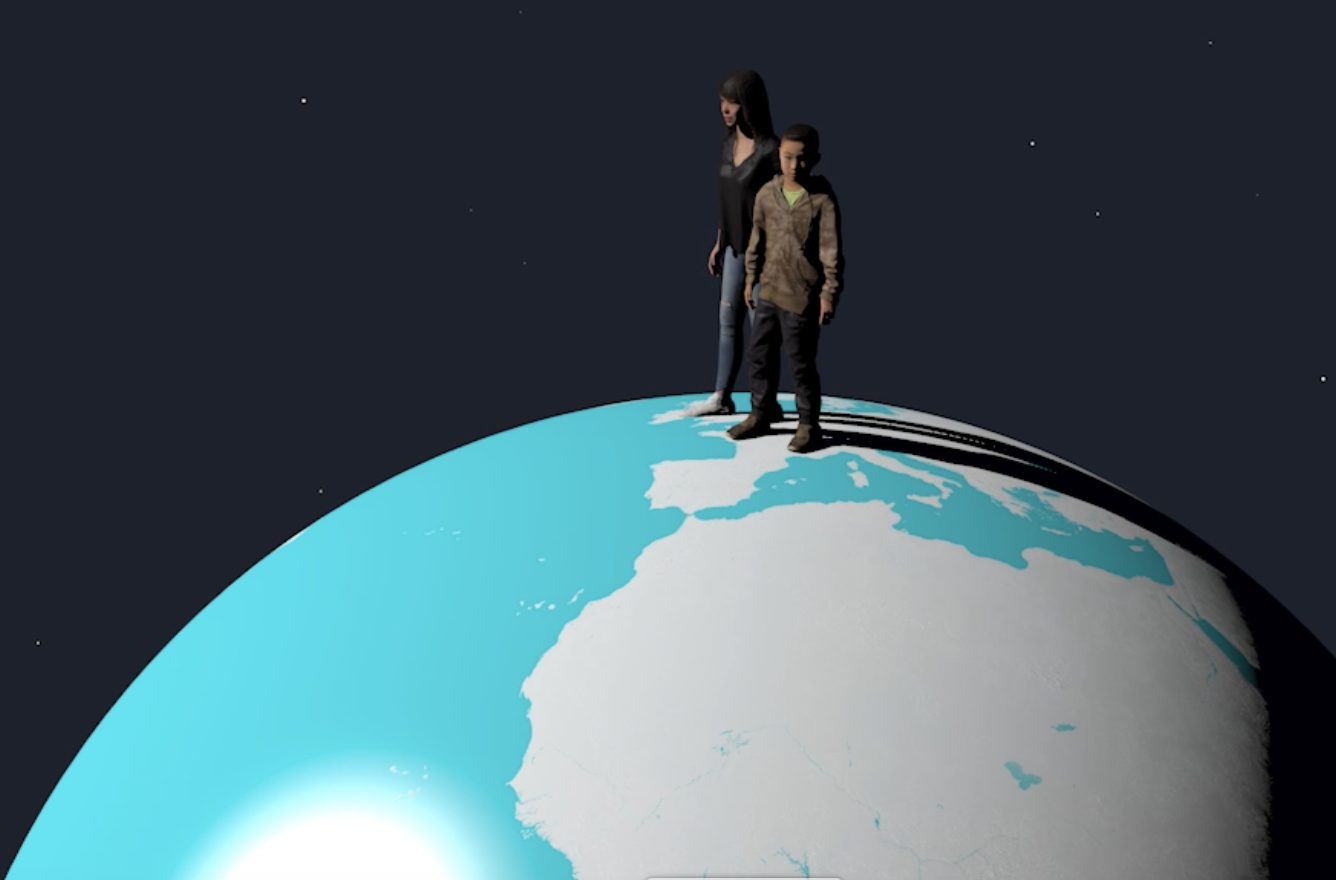
What if every human on the planet woke up tomorrow to believe that the earth is alive? That we inhabit the surface of a living entity that self-regulates and is just bigger and older than other living beings.
A picture tells a thousand words. So imagine a world where anything you can count or measure can be automatically turned into beautiful and physically accurate images by anyone with access to the Internet.
We give data a real-world context. Sometimes that means creating accurately measured objects with computer graphics, to give a sense of scale. Sometimes it means placing 3D representations of data in real-world footage. Sometimes it's both.
The Secretary General of the United Nations has asked countries to ban advertising from fossil-fuel companies. António Guterres has also urged news media and tech companies to stop taking fossil-fuel advertising. Part of the problem is that fossil fuel companies do not tell the whole story.
How do you tie messages about carbon emissions and strategies, or waste and recycling challenges, to the real world? You need data - but data doesn’t speak for itself. Real World Visuals work convinces users that data does not need to be boring.
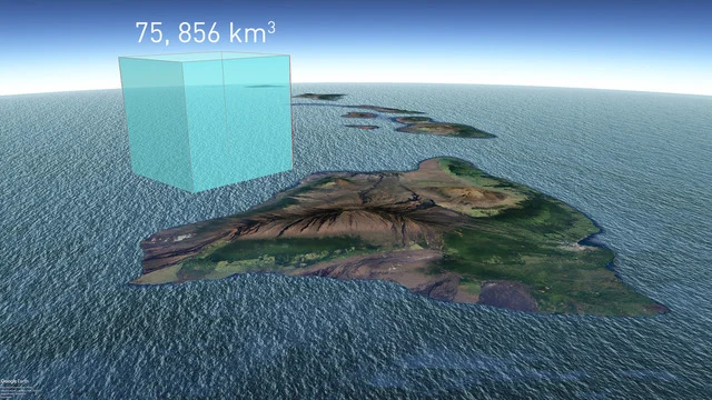
Way back in 2003 I made picture of all the water in the world. I was curious to see it all together and a bit surprised when I’d done the calculation to see how small it looked. Many other people were surprised too. “That can’t be all the water” they’d tell me confidently, “That’s just the fresh water”. But no – all the water in the world could fit into a sphere 1,391 km across (864 miles).
The fact that fossil fuels were included in the text from COP28 is cause for celebration. But scientists are warning that time is running out if we want to avoid widespread climate chaos. That means that communication of the size of the challenge is critical and should not be restricted to stories of climate breakdown. We all need to get better at communicating ‘big carbon’.
Imagine a mobile pavilion in a city centre giving ordinary a real insight into the causes and effects of the climate crisis: A pavilion that links the human suffering and environmental damage caused by wildfires, flooding and heatwaves with actual amounts of greenhouse gases emitted in the past and today. It will do this by bringing our concept of the Carbon Quilt to life.
Burning fossil fuels adds another 100 million tonnes of CO2 to the atmosphere every day*. If this were a single layer of the pure gas at sea level it would cover the entire Earth with a blanket 100 microns deep - the thickness of a piece of paper. And one Gigatonnne of CO2 would be almost exactly 1mm thick. Welcome to the Carbon Quilt, a new way to understand how we are changing the atmosphere - an intimate and human-scale visual tool for understanding global-scale carbon stories.
We all love football and most of us are watching the FIFA World Cup taking place in Qatar. But what about the planet?
The climate crisis is now unfolding. Images of flooding, droughts, wildfires and heat waves are hard to avoid. But in order to genuinely engage we need to see the causes as well. The carbon emissions coming from human activities.
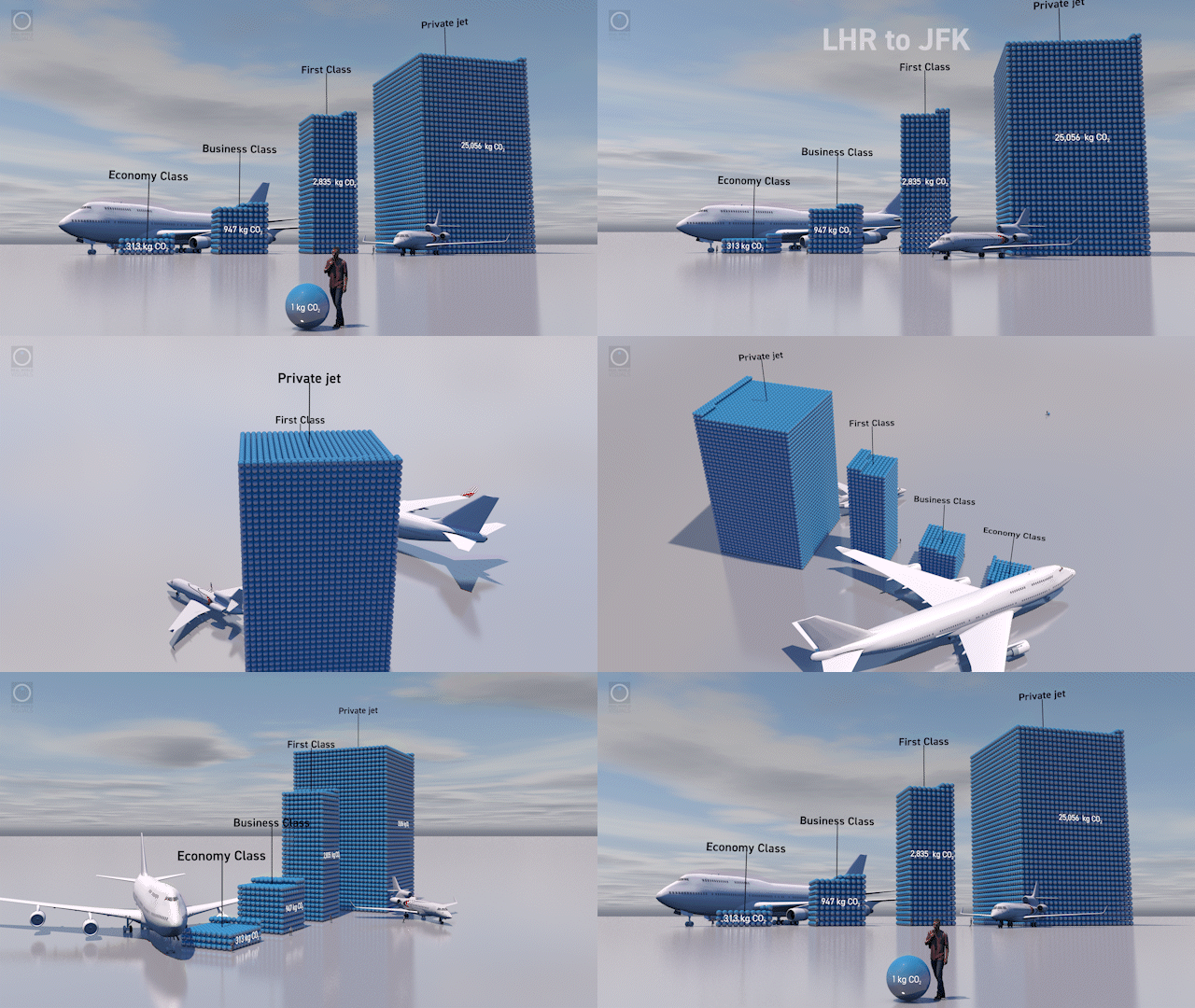
Flying accounts for about two percent of the worlds greenhouse gas emissions, but the impact of some passengers is greater than others. Just one percent of the world’s population account for half of all aviation emissions. In a week when the great and good are flying into the World Economic Forum at Davos by private jet, we have decided to take stock.
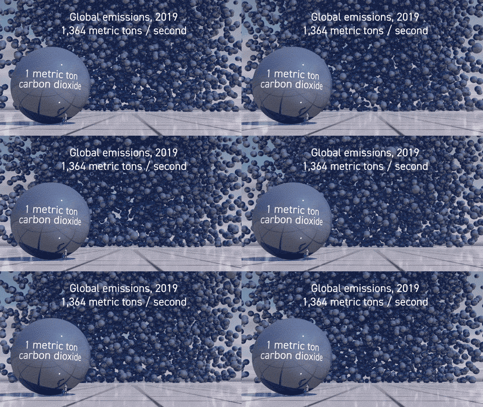
36.7 billion metric tons. That’s the world’s annual carbon dioxide emissions in 2019. But what about if you could ‘see’ this number? Would it help ordinary people realise the extent of the challenge?
Few people have an intuitive feel for what’s at stake when a new coal mine is proposed. So we thought it would be useful for those making the decision to have another view of the coal that will be produced over fifty years, and the carbon dioxide that will be added to the atmosphere too.
In this guest blog JBigelow discusses the role of smart tech in reducing households’ impact on the environment
Humans are not good at responding to invisible threats. We react quickly if something with claws and horns charges towards us out of the forest, but anything invisible tends to be ignored.
Dr Paul Lunt from the University of Plymouth talks about a recent study into peatlands and how they are the world’s best long term biological carbon stores.
How much living stuff is the Earth supporting? In this article we investigate Biomass and some recent data visualisations.
Republican Congressman Mo Brooks earlier this month states that sea-level rise is caused by masses of rocks falling into the sea, not thermal expansion. How can a quick calculation and a sketch help to visualise this?
Data physicalisation and how it can be used to give people a feel - sometimes literally - for unfamiliar quantities.
In a piece that originally appeared Climate Outreach, Jon Turney discusses best-practice in visual climate communication.
If we shared British land equally amongst its 63 million inhabitants, we'd each have just over a third of a hectare. We'd also have 60 trees each.
The recent cluster of hurricanes seem to count against the optimists’ hope that it’s an ill wind that blows no-one any good. Nonetheless, a hurricane hitting the USA five years ago helped an experimental film with a New York City backdrop go global.
Our local residents are doing a great job – 80% of the material that can be recycled is, but that meant that 20% wasn’t, and at a significant cost. The brief to Real World Visuals was to produce visuals and creative that would break through people’s apathy and get their attention - reengaging residents the cost benefits of recycling.
We have been looking at how carbon can be released in the production of some materials common to modern construction.
Air pollution is notably an issue that is gaining considerable attention around the world in all sectors of society - public policy, industry and health... We have been thinking about air pollution for some time: why it needs visualisation and how best to visualise it for all these audiences; for those dealing with the problems air pollution causes, those creating the problem and all of us seeking a solution. Happy National Clean Air day if you are in the UK... now take a deep breath....
The carbon dioxide emissions of the USA in 2014 - 6,870 million metric tons - makes up about 14% of global emissions. This image set shows that amount as a daily pile of spheres / bubbles in Washington DC, cascading over The White House.
Population Explorer is a new crowd-vis tool. Pick a number and Population Explorer will create a population of that size that matches the British population. For instance, in a population of 100 there will be 59 Christians and 25 people with no religion. Population Explorer can be used for any population, but more interestingly it can allow us to use population as a way to understand natural and financial resources.
When you can see yourself in statistics you engage with them on a wholly different level. That’s why at Real World Visuals we help people to see people in statistics about people. Sometimes we need reminding that it is not just numbers we are talking about and sometimes we need reminding to pay attention to the actual numbers rather than misguided intuition.


We have ambitious plans for expansion in 2026 with a game-changing new development. We are looking for early-stage investors to join us on this journey. Show Me allows anyone with access to the internet to visualise anything you can count or measure. It shows the scale of things in a physically relatable way. It creates beautiful and physically accurate animations and still images in seconds. It can be used for one-off animations or added to other developers’ apps with just a few lines of code.