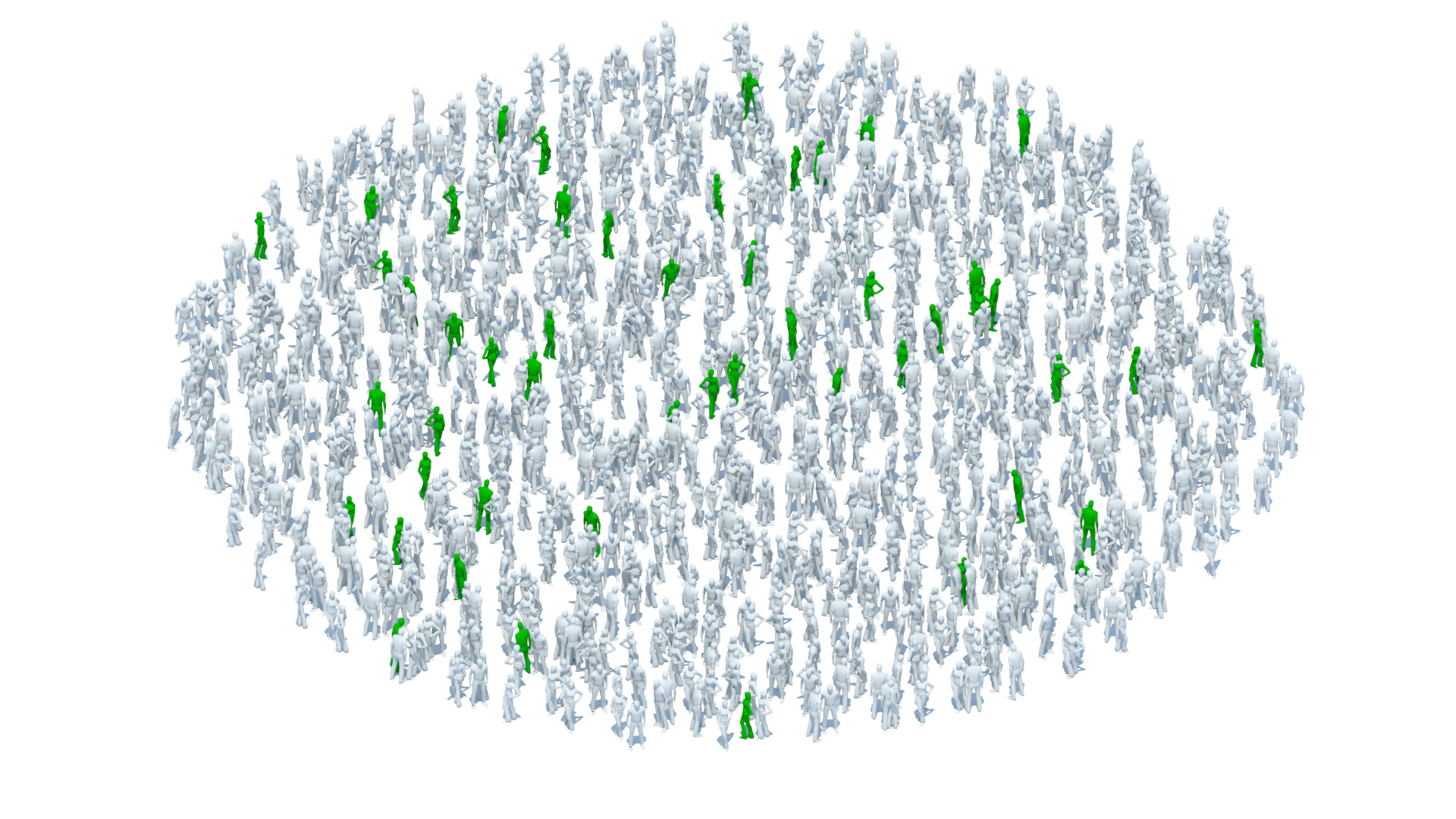
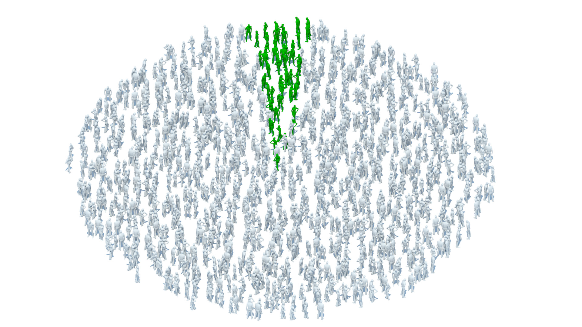
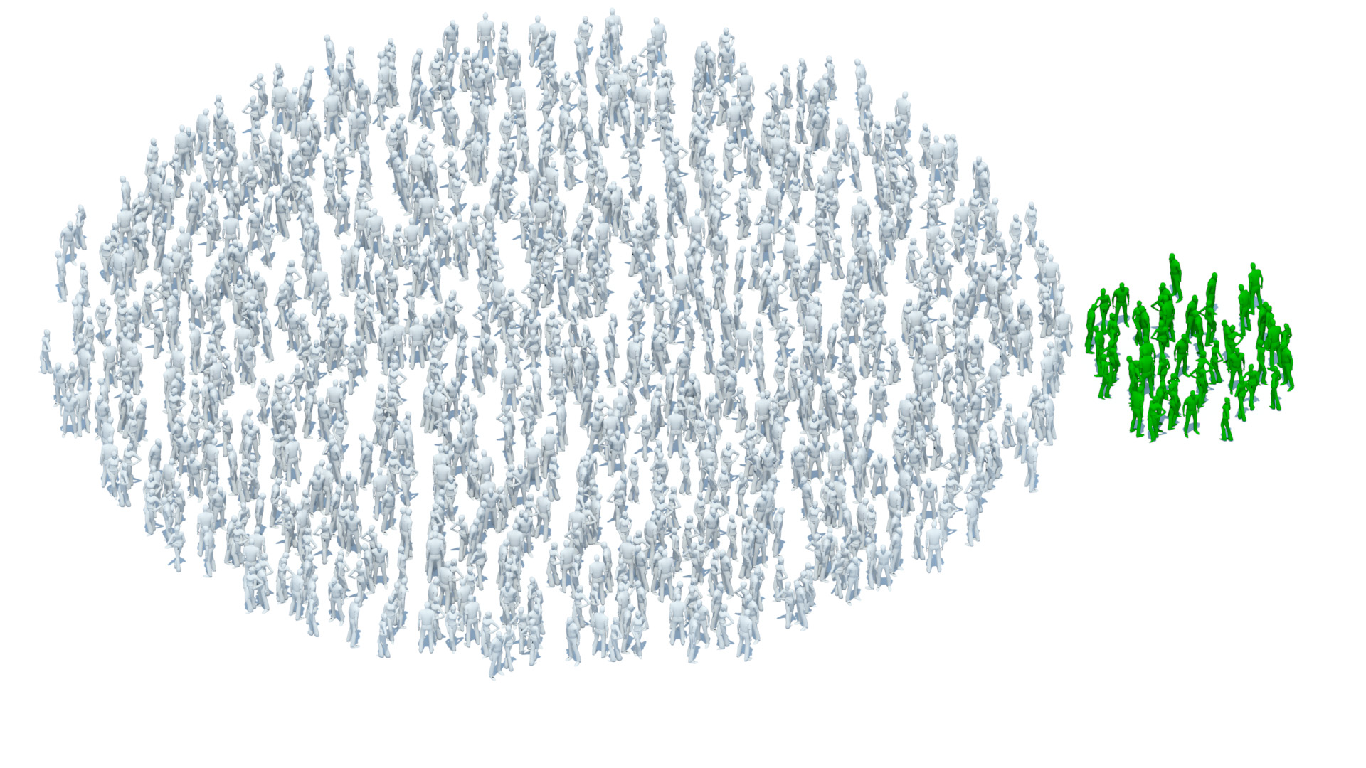
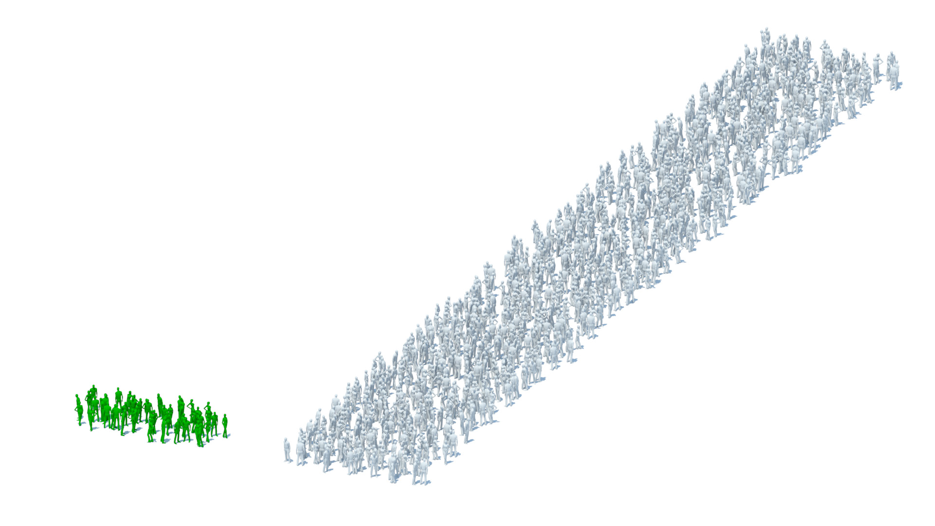
When you can see yourself in statistics you engage with them on a wholly different level. That’s why at Real World Visuals we help people to see people in statistics about people. Sometimes we need reminding that it is not just numbers we are talking about and sometimes we need reminding to pay attention to the actual numbers rather than misguided intuition.
Our simple, but powerful approach is to illustrate individuals. Pie charts might be OK for statisticians who just want answers to their questions about populations, but they ask a lot of audiences who don’t have questions of their own. A pie chart can be about anything, which is, of course, the advantage of abstract visualisation. Showing individual, countable objects makes the chart about things rather than numbers.
“We help people to see people in statistics about people”
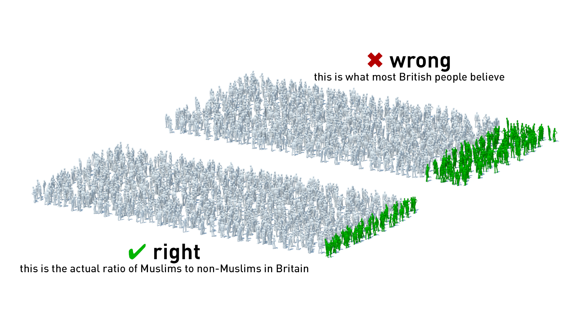
The example at the top of the page shows a number of different ways of representing the proportion of the British population who are Muslim. This is a number for which most people’s intuition is wrong. In a survey (discussed in this Guardian article) most people overestimated the proportion by a factor of 3. In other Western countries the error was even greater, so it is an interesting number to look at. We think it makes a difference to see it represented like this.
In the Muslim charts we are visualising a proportion. They are not actual individuals. But crowd-vis has even more impact when each object represents a real person. We have two political examples below, which each work on different scales. The General Election Visualiser shows every registered voter in every constituency. If you are registered to vote, you will be represented by one of those spots. When you've chosen a constituency, click the circles to zoom in.
Full size version of election-vis tool (opens in new window)
In the Division Visualiser we used the data.parliament.uk API to extract what we could from each division (vote by MPs). It does seem to make a difference to be able to see not just numbers but how particular MPs voted which way and who went through the lobby with them. Currently the API won’t allow us to identify MPs who didn’t vote or the reasons why. The default gender for the unknown politicians is female, but don’t let that confuse you – the actual proportion is 191 women to 459 men.
Full size version of divisions tool (opens in new window)
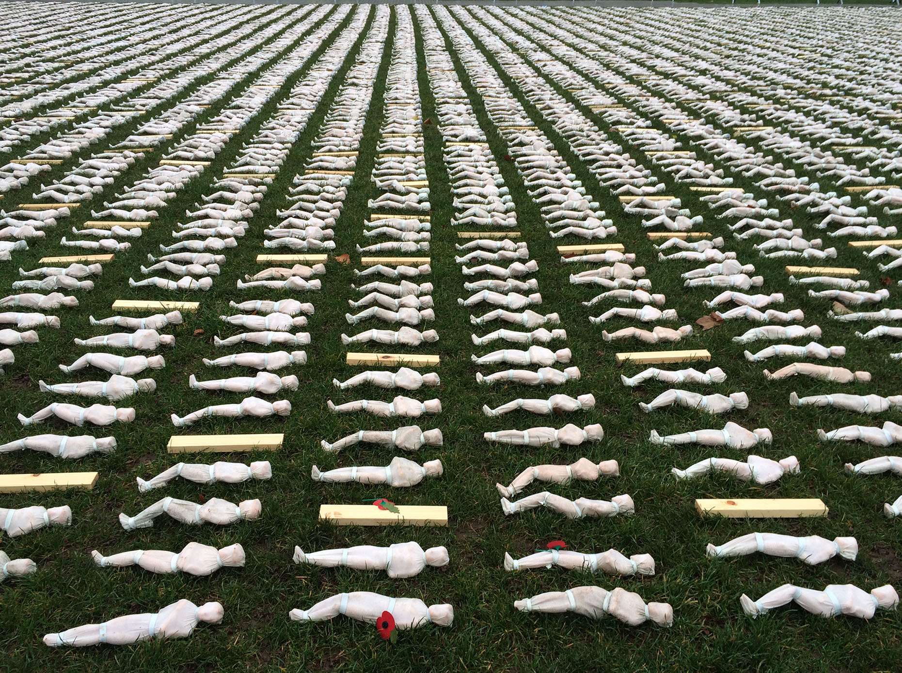
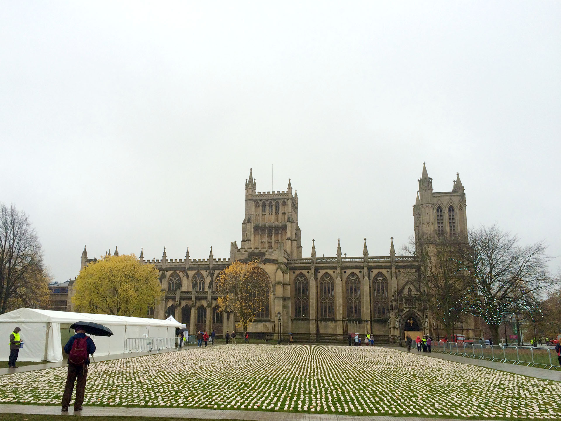
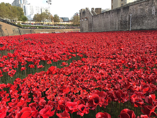
Two particularly affecting examples of crowd-vis commemorate soldiers who died in the First World War. In one, 19,240 Shrouds of the Somme, each fatality on 1 July 1916 (the first day of the battle of the Somme) is represented by a 12 inch shrouded figure. The other, Poppies in the Moat commemorates each of the 888,246 British and Commonwealth soldiers who died in the First World War with a ceramic poppy. The installation filled the moat of the Tower London. These works of art help bring meaning to the numbers, which otherwise may remain just numbers.
The most ambitious crowd-vis to date is Of All the People In All the World by Stan's Cafe - a theatre company. In a series of performances/installations around the world they represented every living person in the world as an individual grain of rice, and then explored particular populations in relation to the whole.
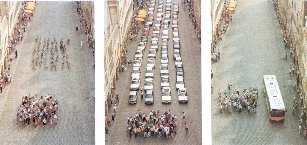
Crowd vis is not just about populations. It can also help make sense of other data, as in this final example, which is not so much about people as space. Crowd visualisations are used here to show how much space cars take up in cities. The image is from a poster created by the City of Munster. See: How Much Space do Cars Take?
We see opportunities for crowd-vis in many types of statistics, but we are particularly excited by opportunities to help viewers make sense of epidemiology, population statistics and economic statistics (e.g. distribution of wealth & income).
We also see opportunities to make sense of the rest of the planet by visualising animal populations and even numbers of trees. According to a recent study, there are 417 trees for each human alive today – but that’s for another blog.
See our new crowd-vis tool: Population Explorer.


