Air pollution is notably an issue that is gaining considerable attention around the world in all sectors of society - public policy, industry and health... We have been thinking about air pollution for some time: why it needs visualisation and how best to visualise it for all these audiences; for those dealing with the problems air pollution causes, those creating the problem and all of us seeking a solution. Happy National Clean Air day if you are in the UK... now take a deep breath....
“We want to show what air quality is like right now. That’s what our particle visualiser (above) is designed to do.”
Awareness of this important topic is in part due to epidemiological studies in recent years that have revealed how deadly air pollution is on a global scale. Air pollution is estimated to cause 7 million premature deaths per year; that’s about 20 thousand deaths a day.
We think we can help reduce the impact by making the invisible threat visible – giving vulnerable people a better chance to protect themselves and keeping it on the political agenda. We tackled air pollution before as part of the Environmental Defense Fund's Clean Heat campaign in New York, but we are keen to explore other ways in which visualisation can help. As with much of our data visualisation work, our focus is on ‘non-engaged’ audiences – people who don’t yet know that they are interested in the topic and so don’t bring questions of their own to the data. How can we make air pollution real for such audiences?
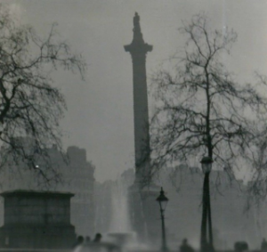
London has had a reputation for air pollution since the thirteenth-century. During frequent ‘pea-soupers’ in the 1950s the smog would get so bad that it would stop traffic, but even though the pollution was visible, few people considered smog a serious risk to health. It was an unpleasant inconvenience yes, but it was not considered to be something either politicians or individuals had to worry about. Nobody had really noticed the sharp spike in deaths associated with air pollution events.
Nelson's column viewed through the Great Smog of 1952, By N T Stobbs (CC BY-SA 2.0)
That changed during the ‘Great Smog’ of 1952. The first hint that smog was dangerous after all was when undertakers ran out of coffins and florists ran out of flowers. It is estimated that 4,000 people died in the Great Smog, and a further 8,000 died in the following weeks and months. Despite resistance from the Conservative government of the time, the impact of the Great Smog eventually led to legislation in the form of the Clean Air Act, 1956.
The Clean Air Act did much to improve air quality, mainly by reducing the use of brown coal in cities, but there was an unfortunate side-effect: the remaining air pollution was invisible. Air pollution is still deadly. A report by Kings College London published in July 2015 estimated that 9,416 Londoners were killed by air pollution in 2010, which is 26 Londoners a day on average – and it is getting worse. This year (2016) London breached its cumulative annual pollution limits in the first week of January . (Under EU rules, sites are only allowed to breach hourly limits of 200 micrograms of NO 2per cubic metre of air 18 times in a year, but Putney broke that limit for the 19 th time on 8 January 2016.)
Kings College London estimate that air pollution killed 9,416 Londoners in 2010. We have produced this Crowd Visualisation this as spots representing an individual life lost.
Road vehicles are a major source of air pollution. In many countries, emissions regulations have been getting steadily tougher. This should have led manufacturers to improve their engines but Volkswagen adopted a cheaper approach. In September 2015, the United States Environmental Protection Agency discovered that Volkswagen had programmed its engines to recognise when it was being tested and switch to a less polluting mode until the test was over. That is, Volkswagen cars only appeared to meet US standards. In real-world driving Volkswagen cars emit up to 40 times more NOx.
The problem with invisible pollution is that even when we know its real it doesn’t feel real. We know for instance that Volkswagen was dishonest but few of us have a feel for how significant their deception was. Does it really affect us? How can we answer that question visually?
We have identified a number of motivations for visualising air pollution:
- Visualising it to make it visible – it is easier to engage with visible threats
- Visualising its overall impact to give a sense of how important it is as an issue
- Visualising particular sources of air pollution both to make them real and to give them a sense of scale (both absolute and relative)
- Visualising the immediate threat in a way that allows people to take action
Different motivations for visualising air quality will generally result in different visualisations. Telling a story like the Volkswagen emission scandal requires a combination of the above. The main visualisation would be one that shows the difference between the claims and the reality for VW cars, but this would need some context: What does a dangerous level of pollution look like? How much pollution do we actually breathe? How much pollution do cars emit?
We are still at the early stages of working out how best to communicate quantities and concentrations of air pollution, but we have some sketches of starting points:
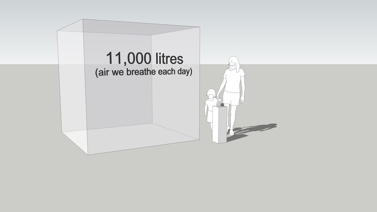
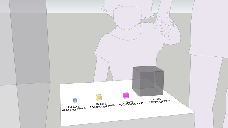
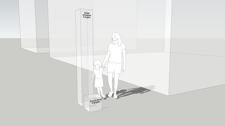
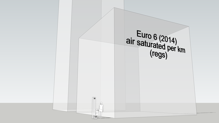
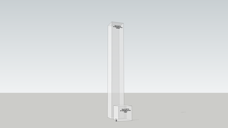
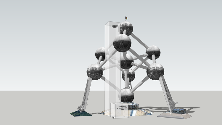
We are trying to make purely numerical emissions standards physically meaningful. We've tried a range of physical metrics including the volume of the pollutants themselves and the volume of air that they saturate to the legal limit (National Objective). So far I think it helps. It makes the invisible threat feel real, which in turn gives us agency: invisible air pollution is just scary, like cancer or something, but visible air pollution is fixable. We are trying to speed up the recognition of the problem so we don't have to wait until air pollution makes itself visible, like London in the 1950s or Beijing today, before something is done about it.
Refs:
This article has be edited from that which appeared on the Carbon Visuals website in February 2016 where there is an interactive version of the particle visualiser (see the top of this post).
For work we have done as Real World Visuals visualising air pollution from cruise ships click here.


